A consultancy that could finally be looked up.
Prevención & Respuesta S.A.S. keeps people alive at height, in confined spaces and in the water. Its site was years out of date and nobody was sending it to anyone. We built the one that makes the case before the call does.
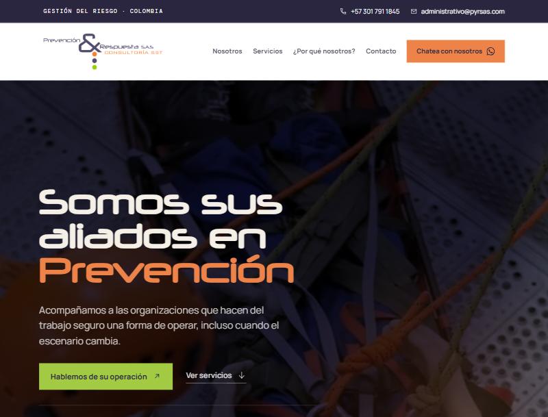
The homepage, live at pyrsas.com
Fifteen years of field experience, and nothing to send anyone.
Prevención & Respuesta is a Colombian team doing work that does not forgive improvisation — height rescue, confined spaces, emergency brigades, water safety. The expertise was never the problem.
The problem was procurement. Safety contracts in Colombia are won by people who have to justify the choice internally, and what the company had to send them was a site years out of date. So they stopped sending it. What went out instead was a WhatsApp number and a few photographs — no service list, no way for a buyer to confirm the team was real before picking up the phone.
They needed the thing that sits between the referral and the first call: a site current enough to be worth sharing, that answers "who are these people and what exactly do they do" without anyone having to ask.
Structure first. The design follows what a buyer needs to read.
The whole site is five numbered chapters — Nosotros, Servicios, Proyectos, ¿Por qué escogernos?, Contacto — in the order a procurement officer actually works through them. Numbering them, visibly, does two things: it tells a reader how much is left, and it makes a phone screen feel like a document rather than an endless scroll.
The services section carries the most weight, so it got the most structure: five service families, each opened into the specific capabilities underneath it — twenty-four in total, from trabajo en alturas to rescate vehicular. A buyer can scan the family and stop, or read down into the detail that matches the job they have. Nothing is hidden behind a "contact us for more information".
The tone was the other half of the work. The reference sites in this sector sell fear. This one does not: the copy is plain, first-person-plural Spanish — prevención técnica, respuesta humana — and the photography is of real gear and real height work, not stock hard hats. Hero typography is set large and tight so the promise reads in one pass on a phone held at arm's length.
It is hand-coded, no page builder, and it deploys to Vercel on their own domain, so the company owns the thing outright and nothing expires if a subscription lapses.
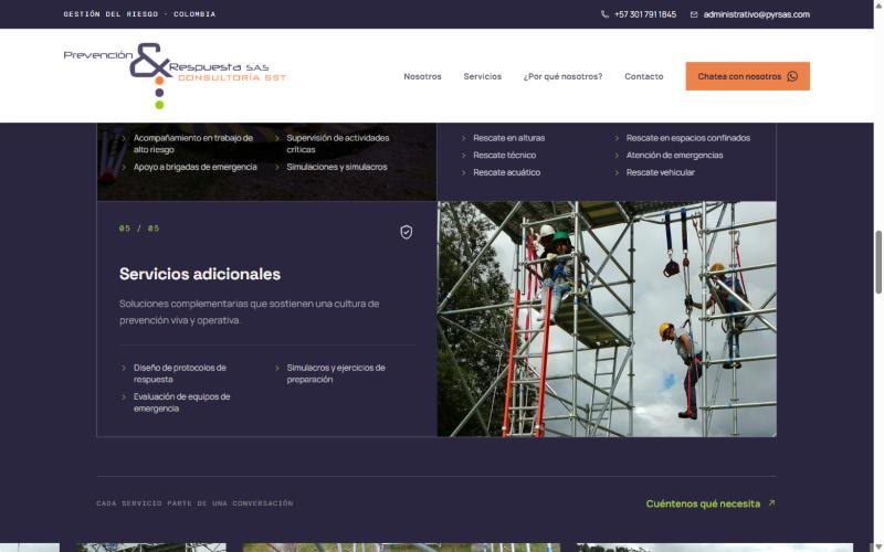
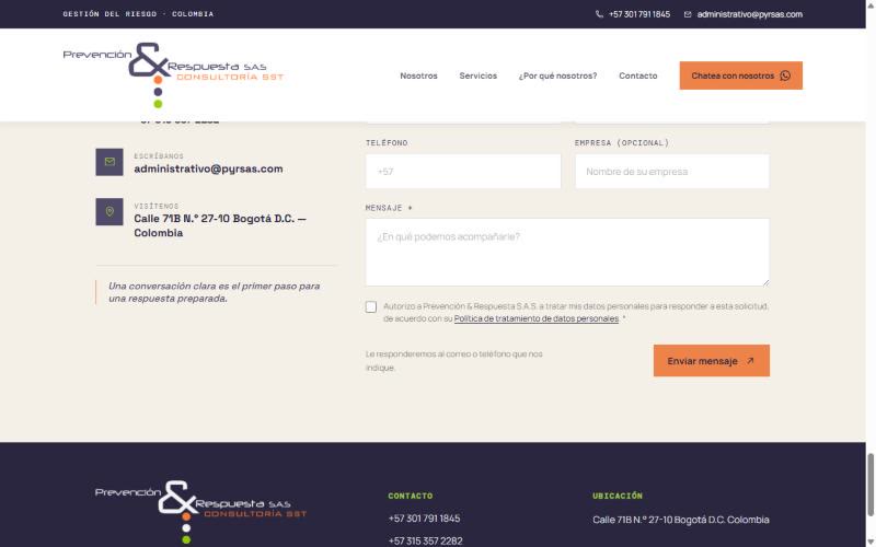
The services catalogue and the contact chapter, captured from the live site
A company that can now be checked before it is called.
They have a calling card again. The site is live on its own domain with the full service catalogue, the team's own words, and a contact form that routes straight to the administrative inbox with the data-protection consent Colombian law requires. Two insurers — Seguros Bolívar and Colmena Seguros — sit on the page as named references.
The difference is not that they went from nothing to something: it is that the something is now current enough to send. More people are reaching the company through it, and it has become the thing they lead with instead of the thing they apologise for.
Design, front-end build and deployment, end to end. Spanish copy written for the site.