An identity taken from light on a stone brow.
David Arroyave is an artist, a trader and a coach with a book to sell, and all three were being introduced by the same blank page. The mark, the type system and the palette all come out of one photograph.
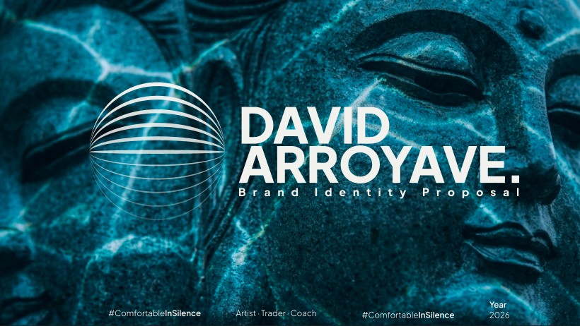
The proposal cover — approved by David for portfolio use
Three practices, one person, no way to tell they belonged together.
David paints, trades, and coaches, and he had a book coming. Each of those arrives in front of a different audience with a different level of scepticism — a gallery visitor, someone weighing a trading mentor, a reader picking a cover off a table.
There was no identity holding them together. Every post, cover and deck started from nothing, so each one looked like a different person's work, and the one thing that should have been obvious — that the painter and the coach are the same man, and that this is the point — was the thing nobody could see.
The brief was not a logo. It was a system durable enough to carry a signature on a canvas, a chart annotation and a book spine without any of the three looking borrowed from the others.
Start from one image, and refuse to add a second idea.
The identity comes from a single photograph: teal light falling across the brow of a stone Buddha. It already held everything the brand needed to say — stillness, weight, a face half in shadow — so the work became extraction rather than invention.
The mark is the lid. The arc of the eyelid in that photograph, stacked and repeated, reads as a lowered eye, as layered strata, and as a chart's stepped levels, depending on which of David's three practices you are looking at it in. One form, three readings, no symbol bolted on for any of them.
The palette is sampled from the photograph rather than picked from a wheel — the cool blue of the lit side against the near-black of the shadowed stone — which is why it sits on a photographic background without fighting it. Type is set quietly: the name in a restrained sans with generous tracking, so the mark is always the loudest thing in the lockup.
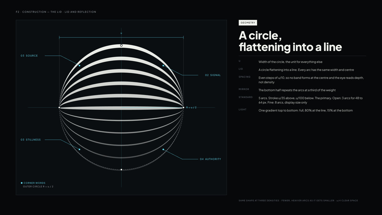
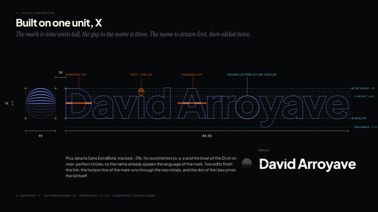
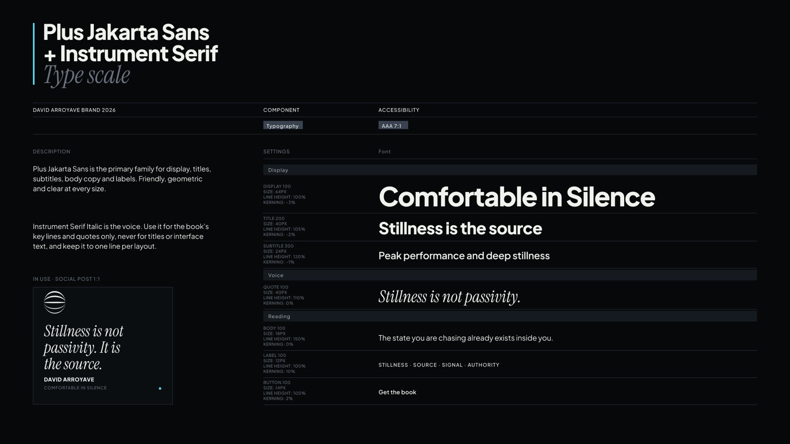
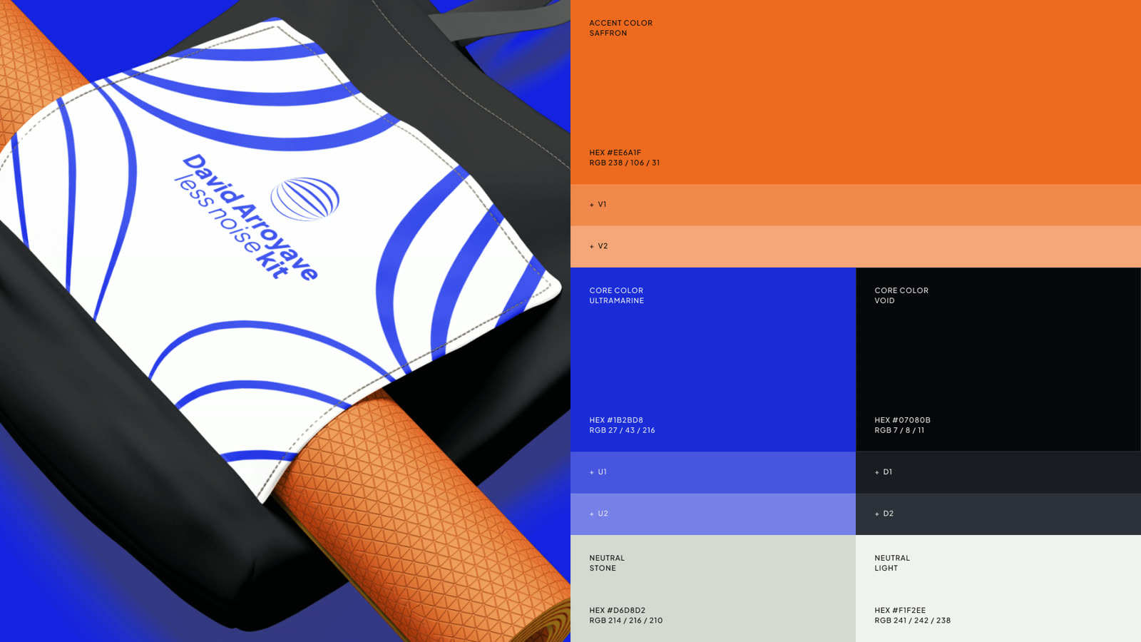
From the brand presentation — construction, lockup, type and palette
One mark that survives a canvas, a chart and a book spine.
The mark, palette and type system are approved and in use, and David has cleared the work to be shown here. He gained 50 followers in the first month carrying it.
The bigger change is what it let him do next. With a guideline to work against he is now shooting video inside the identity rather than deciding the look shot by shot, which is what turns a scattered feed into something that reads as one person selling one thing. The written document — the part that makes the system usable by whoever he hires after me — is still being finished.
Mark, lockups, palette, type system and art direction. Written guideline in progress.